-
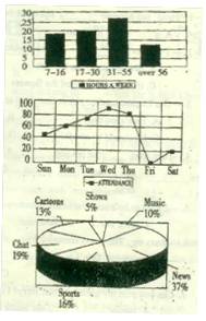
Last year, some groups of students in their community made a survey about “How do people spend their free time? ” The following diagrams show some results of it:
Diagram (1): Hours for people of different ages who surf the Internet in a week.
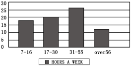
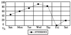
Diagram (2): Different days people go to the library. (library attendance)


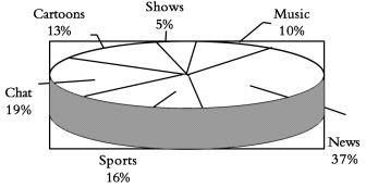
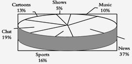
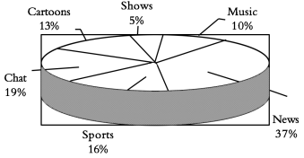
Diagram (3): Different programs people like.
1.People aged spend the most time surfing the Internet every week.
A. 7—16 B. 17—30 C. 31—55 D. over 56
2. How many people go to the library on Saturdays?
A. About 20%. B. About 40%.
C. Over 60%. D. More than 80%.
3.Which of the following is TRUE according to the diagrams?
A. The fewest people like watching music programs.
B. Sports are the most people’s favorite programs.
C. People seldom go to the library on weekdays.
D. Half of the people like watching news and cartoons.
4. The three diagrams show us the results of a survey about
A. what people do every day
B. people’s different habits.
C. people’s different lifestyles
D. how people spend their free time
-
Last year, some groups of students in their community made a survey about “How do people spend their free time?” The following diagrams show some results of it:
Diagram (1): Hours for people of different ages who surf the Internet in a week.
Diagram (2): Different days people go to the library. ( library attendance )
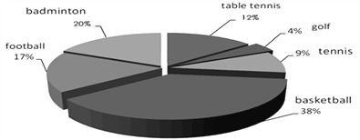
Diagram (3): Different sports people like.
D (1) D(2)

 D (3)
D (3)
1.People aged spend the most time surfing the Internet every week.
A. 7~16 B. 17~30 C. 31~55 D. over 56
2.The word “attendance” in Diagram (2) means “ in the library”.
A. the hours people spend B. the number of people
C. the number of books D. the days people spend
3.How many people go to the library on Saturdays?
A. About 20%. B. About 40%.
C. Over 60%. D. More than 80%.
4.Which of the following is TRUE according to the diagrams?
A. The fewest people like playing tennis.
B. Football is the most people’s favorite sport.
C. People seldom go to the library on weekdays.
D. The most people like playing basketball.
5.The three diagrams show us the results of a survey about .
A. what people do every day B. people’s different habits
C. people’s different lifestyles D. how people spend their free time
-
Last year, some groups of students in their community made a survey about “How do people spend their free time? ” The following diagrams(图表) show some results of it:
Diagram (1): Hours for people of different ages who surf the Internet in a week.
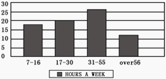
Diagram (2): Different days people go to the library. (library attendance)

Diagram (3): Different programs people like.
1.People aged spend the most time surfing the Internet every week.
A. 7~16 B. 17~30 C. 31~55 D. over 56
2.How many people go to the library on Saturdays?
A. About 20%. B. About 40%. C. Over 60%. D. More than 80%.
3.Which of the following is TRUE according to the diagrams?
A. People seldom go to the library on weekdays.
B. Sports are the most people’s favorite programs.
C. The fewest people like watching music programs.
D. More people enjoy news programs than cartoons programs.
-
Last year, some groups of students in their community (社区) made a survey about "How do people spend their free time?" The following diagrams show some results of it:
Diagram (1): Hours for people of different ages who surf the Internet in a week.

Diagram (2): Different days people go to the library. (library attendance)
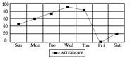
Diagram (3): Different programs people like.

根据上面三个图表内容,选择正确答案。
1.People aged ________ spend the most time surfing the Internet every week.
A.7—16 B.17—30 C.31—55 D.over 56
2.The word "attendance" in Diagram (2) means " ________ in the library".
A.the hours people spend B.the number of people
C.the number of books D.the days people spend
3.On weekends, ________ people go to the library every week.
A.over sixty B.less than sixty
C.about twenty D.more than one hundred
4.Which of the following is true according to the diagrams?
A.The fewest people like watching music.
B.Sports are the most people's favorite programs.
C.People seldom go to the library on weekdays.
D.Half of the people like watching news or cartoons.
5.The three diagrams show us the results of a survey about ________.
A.what people do every day
B.how people spend their free time
C.people's different lifestyles
D.people's different habits
-
Last year, some groups of students in their community (社区) made a survey about “How do people spend their free time? ” The following diagrams(图表) show some results of it:
Diagram (1): Hours for people of different ages who surf the Internet in a week.
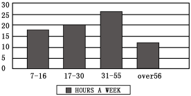
Diagram (2): Different days people go to the library. (library attendance)
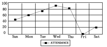
Diagram (3): Different programs people like.
1.People aged spend the most time surfing the Internet every week.
A. 7—16 B. 17—30 C. 31—55 D. over 56
2.The word “attendance” in Diagram (2) means “ in the library”.
A. the hours people spend B. the number of people
C. the number of books D. the days people spend
3.How many people go to the library on Saturdays?
A. About 20%. B. About 40%.
C. Over 60%. D. More than 80%.
4.Which of the following is TRUE according to the diagrams?
A. The fewest people like watching music programs.
B. Sports are the most people’s favorite programs.
C. People seldom go to the library on weekdays.
D. Half of the people like watching news and cartoons.
5.The three diagrams show us the results of a survey about .
A. what people do every day B. people’s different habits
C. people’s different lifestyles D. how people spend their free time
-
阅读下面短文,从每题所给的四个选项(A、B、C和D)中,选出最佳选项。
Last year some groups of students in their community(社区) make a survey about "How do people spend their free time?' The following diagrams (图表) show some results of it.
Diagram (1): Hours for people of different ages who surf the Internet in a week.
Diagram (2): Different days people go to the library.(library attendance)
Diagram (3): Different programs people like.
根据上面三个图表内容,选择正确答案
1.People aged__________spend the most time surfing the Internet every week.
A.7 ---6 B.17 ------ 30
C.31 ----- 55 D.over 56
2.On Wednesday, __________people go to the library every week.
A.over sixty B.less than sixty
C.about twenty D.more than one hundred
3.According to the third diagram about ______of people like watching Cartoons?
A.16%. B.19%
C.13% D.37%.
4.Which statement is right according to the survey?
A.Some students made the survey in their school last year.
B.More people like sports than chat in the survey.
C.Less than 80 people join in the survey about library attendance.
D.People of different ages spend different time surfing the Int ernet.
5.The three diagrams show us the results of the survey about__________.
A.what people do every day
B.how people spend their free time
C.people's different lifestyles
D.people's different habits
-
阅读下面短文,从每题所给的四个选项(A、B、C和D)中,选出最佳选项。
A
Last year some groups of students in their community(社区) make a survey about "How do people spend their free time?' The following diagrams (图表) show some results of it.
Diagram (1): Hours for people of different ages who surf the Internet in a week.
Diagram (2): Different days people go to the library.(library attendance)
Diagram (3): Different programs people like.
根据上面三个图表内容,选择正确答案
1.People aged__________spend the most time surfing the Internet every week.
A. 7 ----16
B. 17 ------ 30
C. 31 ----- 55
D. over 56
2.On Wednesday, __________people go to the library every week.
A. over sixty
B. less than sixty
C. about twenty
D. more than one hundred
3.According to the third diagram about ______of people like watching Cartoons?
A. 16%.
B. 19%
C. 13%
D. 37%.
4.Which statement is right according to the survey?
A. Some students made the survey in their school last year.
B. More people like sports than chat in the survey.
C. Less than 80 people join in the survey about library attendance.
D. People of different ages spend different time surfing the Int ernet.
5.The three diagrams show us the results of the survey about__________.
A. what people do every day
B. how people spend their free time
C. people's different lifestyles
D. people's different habits
-
| 
A flying disk(飞碟)is made of plastic(塑料).It was back in the 1950s.A group of college students came into a restaurant to eat some apple pies.After eating the apple pies,they felt bored,so they wanted to play a game.They threw the plates here and there.In this way,the flying disk came into being. |
| 
A camera is used for taking photos.It was invented in 1827 by Joseph in Italy.It's often used by the photographers to take pictures.There are many fascinating pictures to be taken in order to help you to remember the beautiful views. |
| 
An umbrella is a most useful tool.It was invented over 4,000 years ago.It was invented in China and Egypt.It's used for keeping the rain out.When the sun is shining in the sky,an umbrella is also used to keep the sun out.It is still used today. |
| 
A bike is a very useful tool in the world today.It is very cheap to travel on your bike.Taking a trip by bike is pleasant,because you can enjoy the beautiful sunshine in autumn and you can share the cool fresh air in summer.Riding a bike is good for the environment. |
1.The flying disk is used for .
A. taking photos
B. playing a game
C. keeping the rain out
2.The first camera was invented by .
A. an Italian B. a Chinese C. a college student
3.Taking a trip by bike is pleasant because .
A. it is very fast
B. you can get close to nature
C. it can keep the sun out
4.The invention“ ”has the longest history of the three.
A. a flying disk
B. a camera
C. an umbrella
5.Which of the following is TRUE?
A. The camera was made in the 1950s.
B. The flying disk was invented by Joseph.
C. The umbrella was invented in China and Egypt.
-
The research group ________ 15 members has made great achievements in recent years.
A. made up of B. made of C. made from D. made by

